Overview
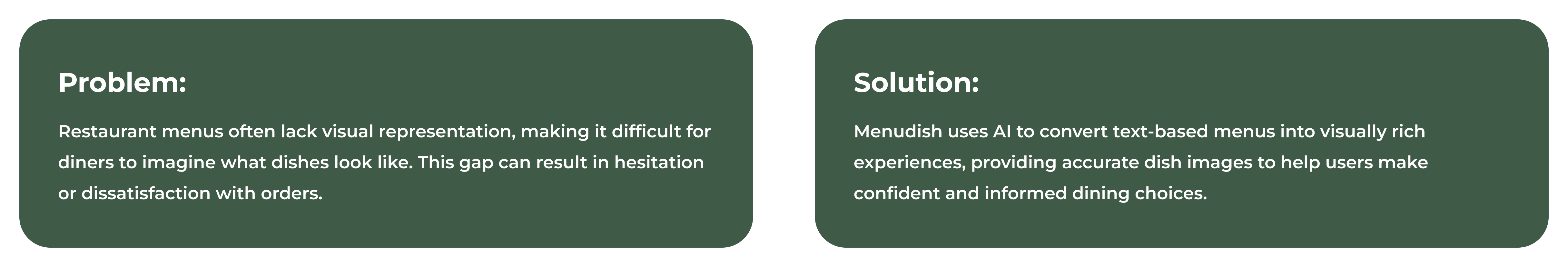
Menudish is a revolutionary mobile application that reimagines the dining experience by blending AI technology with intuitive design. The app enables users to scan restaurant menus and instantly view visually accurate dish representations. By bridging the gap between text-based menus and visual understanding, Menudish empowers users to make confident, informed decisions effortlessly while enhancing their overall dining experience.
Challenges
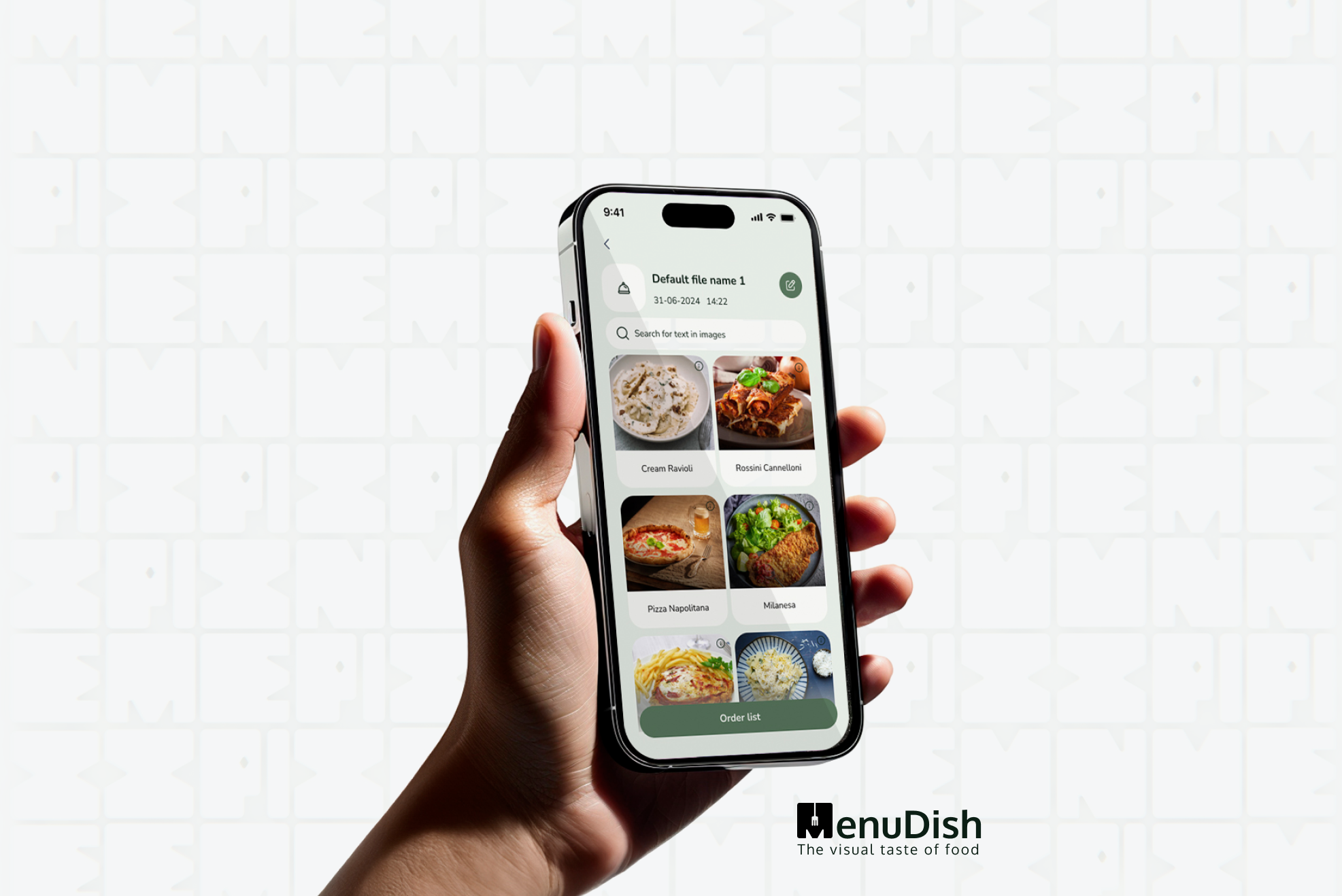
⚈ Menu Scanning: Quickly scan any menu and convert it into a visual format.
⚈ AI-Powered Visuals: Generate accurate dish images to aid decision-making.
⚈ Saved Menus: Save previous scans for easy access and reuse.
⚈ User-Friendly Navigation: A clean, intuitive design ensures smooth interactions.
Research
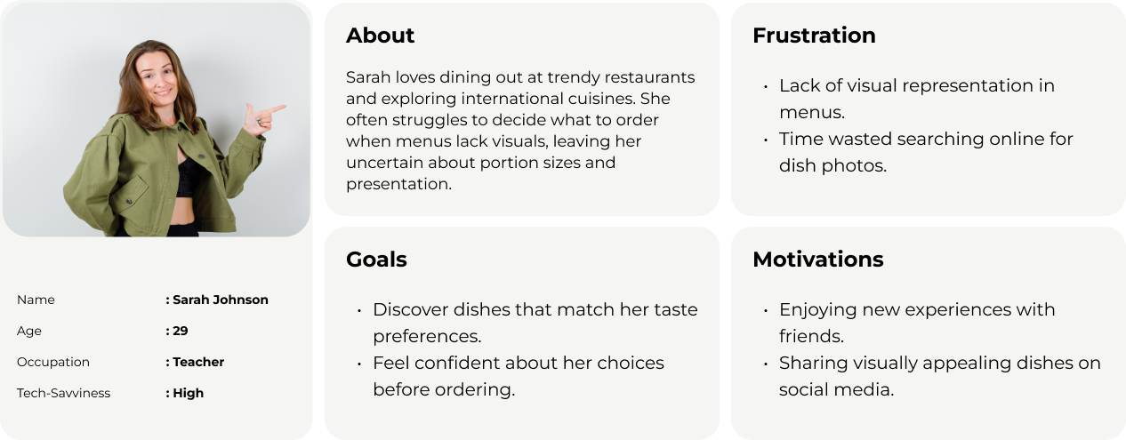
The research phase laid the groundwork for a user-centered design approach, focusing on uncovering the challenges and expectations of diners. Through in-depth interviews with a diverse group of participants, including frequent diners and tech-savvy individuals, we gained valuable insights into their experiences with traditional menus.
Key Insights
⚈ Lack of Visuals: Users found it difficult to imagine dishes due to the absence of visual representations, often leading to uncertainty or dissatisfaction.
⚈ Decision Fatigue: Many felt overwhelmed by large, text-heavy menus or unfamiliar options.
⚈ Desire for Simplicity: Participants expressed a strong preference for intuitive tools that enhance their dining experience without adding complexity.
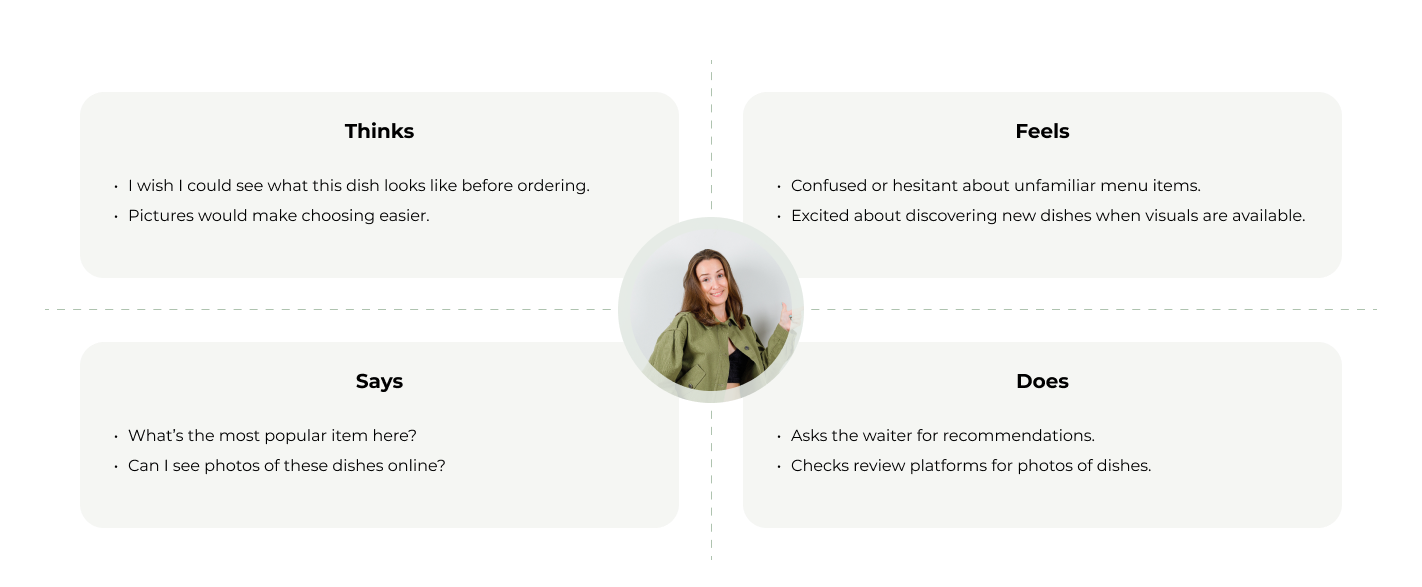
To better understand users’ behaviors and emotions, we developed an empathy map:
The empathy map highlighted users’ pain points and emotional needs, reinforcing the need for a simple, visually engaging solution.
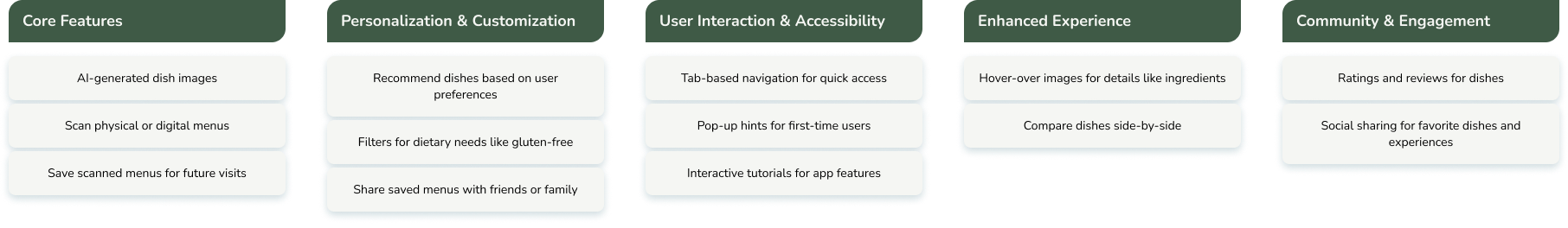
After gathering user research and defining personas, we used an Affinity Diagram to categorize insights and identify recurring themes. By clustering user pain points, behaviors, and needs, we gained a clearer understanding of the most pressing challenges. This process helped us prioritize solutions and shape the design direction to create a more intuitive and user-friendly experience.enhancing their overall experience.
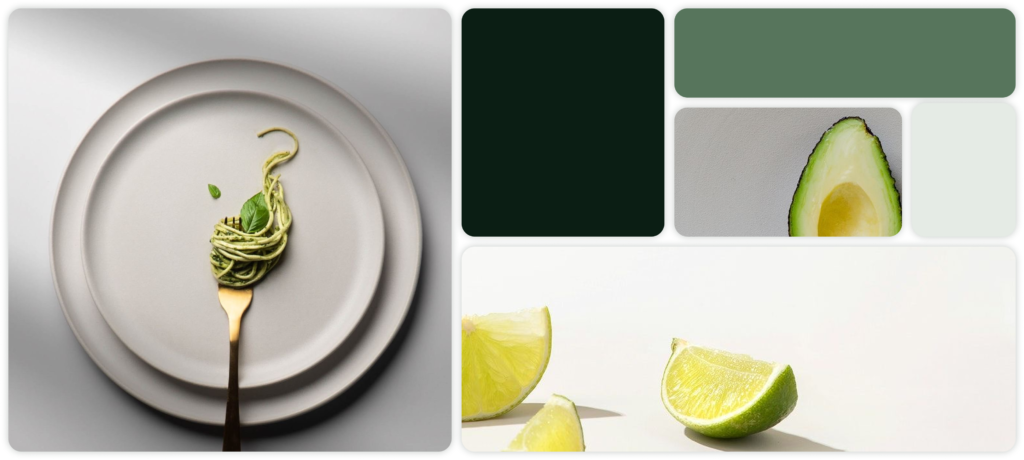
Inspired by the simplicity of traditional paper menus and the convenience of modern technology, my design for MenuDish focuses on clarity, accessibility, and an intuitive dining experience. The visual language blends minimalist UI elements with AI-powered innovation, ensuring users can navigate menus effortlessly while enjoying a sleek and engaging interface.
Testing these initial designs with users provided valuable feedback, allowing the team to iterate quickly and ensure the proposed solutions aligned with user needs. This phase set the foundation for creating an intuitive and visually engaging user experience in the subsequent design stages.
Ideate
Mapping out the user flow helped define the app’s core navigation and interactions, ensuring a seamless experience from scanning a menu to viewing AI-generated dish visuals. By structuring the journey efficiently, we minimized friction and made the process intuitive for users.
Hand-drawn wireframes served as the first visual representation of the app, allowing us to explore layout ideas and refine functionality before moving into high-fidelity design. These early sketches focused on simplicity and usability, ensuring a smooth transition into the UI design phase.
Usability Test Plan
The usability testing for MenuDish aimed to evaluate the app’s effectiveness, intuitiveness, and overall user experience by identifying usability issues and refining the design. Five participants, aged 18-45, including casual diners, tourists, and food enthusiasts with varying tech expertise, engaged in remote sessions. They completed key tasks such as navigating the home screen, scanning menus, viewing AI-generated dish images, saving and accessing previous scans, and adjusting settings. Expected behaviors included intuitive navigation, smooth scanning, easily accessible dish visuals, effortless menu retrieval, and straightforward customization. Insights from this test will help enhance user engagement and usability.
Positive Feedback
- Easy Navigation: Most users found the app’s interface intuitive and clean.
- Useful Visuals: AI-generated dish images were appreciated for improving decision-making.
- Quick Scanning Process: Users liked the seamless scanning experience.
Pain Points Identified
- Lack of Guidance for First-Time Users: Some users struggled to understand the scanning process.
- Handling Multi-Page Menus: Users were unsure how to scan menus with multiple pages.
- Need for More Item Details: Participants wanted additional details beyond images, such as ingredients, prices, and dietary labels.
The usability test provided critical insights into how users interact with MenuDish, revealing both strengths and areas for refinement. By implementing these changes, we improved the app’s overall usability, making it more intuitive and user-friendly for a diverse audience.
User Feedback & Implemented Improvements
High-Fidelity Design
The UI/UX design phase focused on transforming the refined wireframes into visually appealing and functional interfaces. Guided by the principles of simplicity, accessibility, and brand alignment, this phase involved crafting high-fidelity mockups that brought the app’s core features and interactions to life.
Key visual elements like color palettes, typography, and iconography were carefully selected to reflect the app’s identity and enhance usability. The design emphasized a clean layout, intuitive navigation, and consistency across all screens to ensure a seamless experience. Special attention was given to the three main pages—Home, Scan, and Settings—to maintain a straightforward user flow.
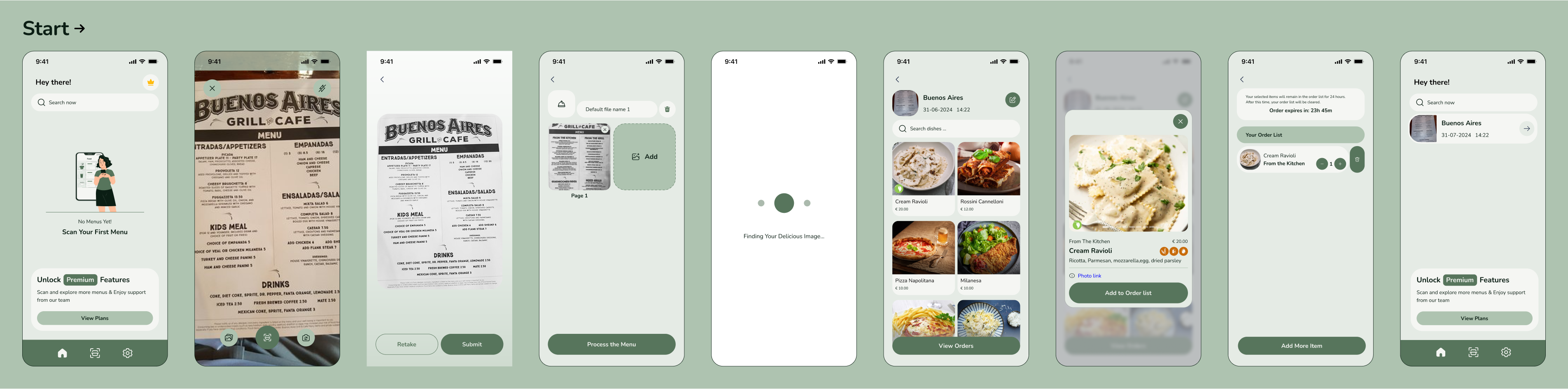
To conclude the presentation, I will showcase the full user journey—from scanning a menu to viewing the AI-generated dish photos. This step-by-step demonstration will highlight how the app simplifies the dining experience and provides users with a seamless, visually rich menu.
Takeaways
Addressing the lack of visual representation in menus has greatly enhanced decision-making for users, providing them with a clearer and more engaging way to explore dishes. The design process was shaped by continuous user feedback, which led to iterative improvements, ensuring the final product truly reflects user needs. Additionally, achieving the right balance between advanced AI technology and simplicity in the interface was a key factor in delivering a seamless, user-friendly experience.