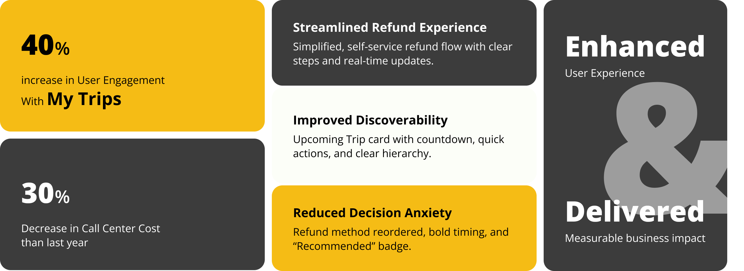
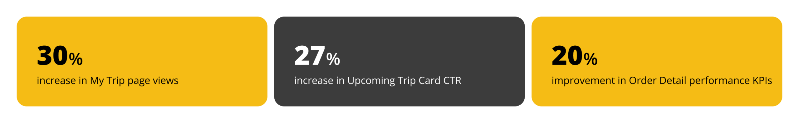
The My Trip redesign focused on simplifying the post-purchase experience, especially the refund flow. By improving visibility, clarifying rules and timelines, and adding real-time tracking and reassurance, users could complete tasks with less confusion and fewer support needs. These changes led to measurable impact, including a 30% increase in My Trip views, 27% higher engagement with the Upcoming Trip card, and a 20% improvement in Order Detail KPIs, while also reducing support calls and increasing overall user satisfaction.
Overview
Alibaba Travel is a booking platform for trains, planes, buses, hotels, tours, and other travel services. The “My Trip”section allows users to manage their bookings after purchase. As the lead designer, my role is to redesign and refine the “My Trip” section to enhance the post-purchase experience for users who have booked any Alibaba Travel service.
Project Goal
⚈ Reduce call-per-order rates by improving self-service options.
⚈ Lower call center costs by minimizing reliance on customer support.
⚈ Enhance user satisfaction by creating a seamless and intuitive post-purchase experience.
Problem Statement
Users often struggle to manage their bookings after purchasing a travel service on Alibaba Travel. Many find it difficult to locate their trips, navigate the modification or cancellation process, and access related services like add-ons or support. These challenges lead to frustration, increased customer support calls, and higher operational costs, making an improved post-purchase experience essential.
Design & Development Constraints
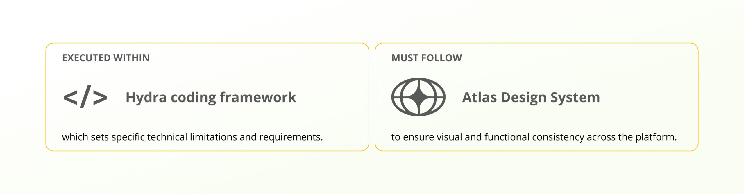
This redesign must adhere to the Atlas Design System to ensure visual and functional consistency across the platform. Additionally, the development will be carried out using the Hydra coding framework, which sets specific technical limitations and requirements. These constraints define the scope of the redesign and guide the implementation process.
User Research: Understanding the Refund Flow
To improve the refund experience, it’s essential to gather both quantitative and qualitative data to identify user pain points and behaviors. At this stage, we lack direct behavioral data from the “My Trip” section, making it challenging to track user interactions, navigation patterns, or pain points. Without this data, pinpointing areas for improvement is difficult.
To address this gap, we conducted call center analysis and a heuristic evaluation. These methods provided valuable insights into recurring issues and usability flaws, forming the foundation of our redesign approach. Moving forward, we plan to implement analytics tracking to measure user interactions and continuously optimize the refund process.
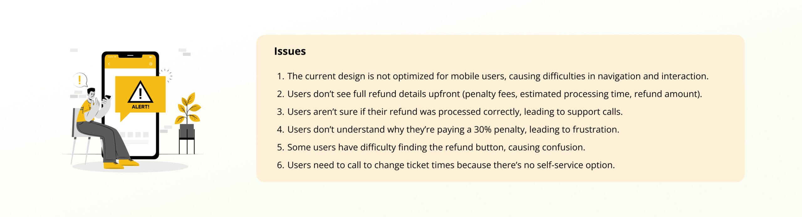
Call Center Data
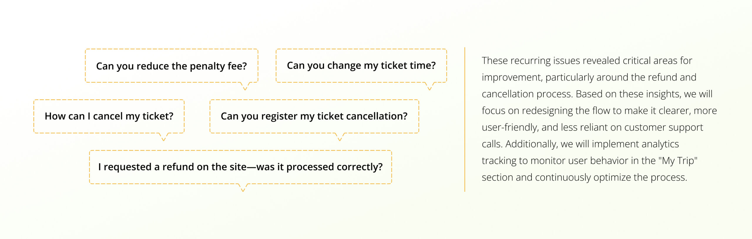
We analyzed over 100 call center recordings related to the “My Trip” section to understand common user issues regarding refunds and cancellations. After systematically reviewing the recordings, we categorized the reasons for user calls. Key user questions and concerns included:
Heuristic Evaluation Process & Team Meeting
To refine the “My Trip” refund flow, we conducted a heuristic evaluation with the team, focusing on usability issues and improvement opportunities. The process included a team meeting and brainstorming session with UX designers, developers, and product managers. We reviewed the flow against Nielsen’s 10 usability heuristics, identifying key usability problems and assessing their impact on users. We then prioritized these issues, focusing on those that cause the most frustration or lead to increased support calls.
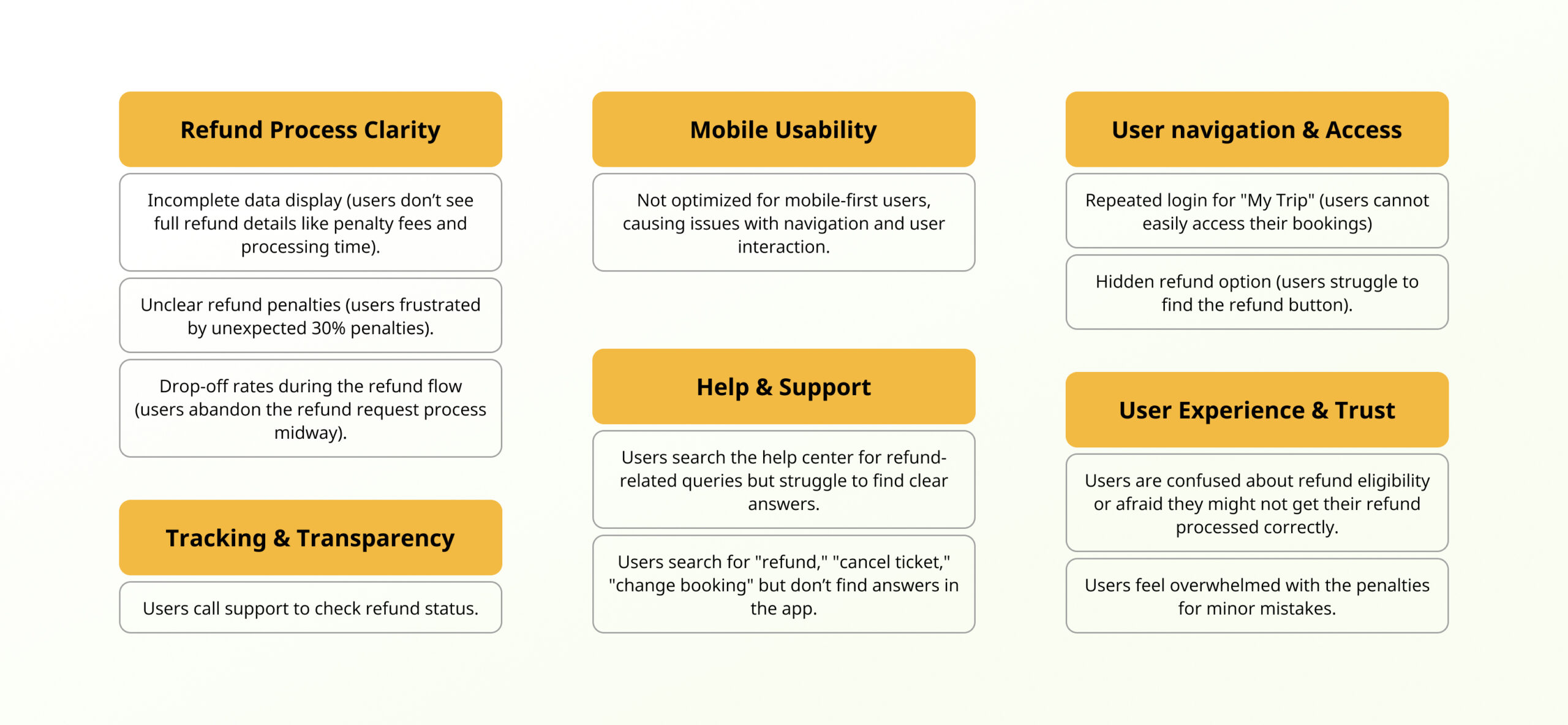
Define: Prioritization of Issues
From our research, we identified that most issues were linked to the refund process. We prioritized problems using an affinity diagram and selected the top five for action.
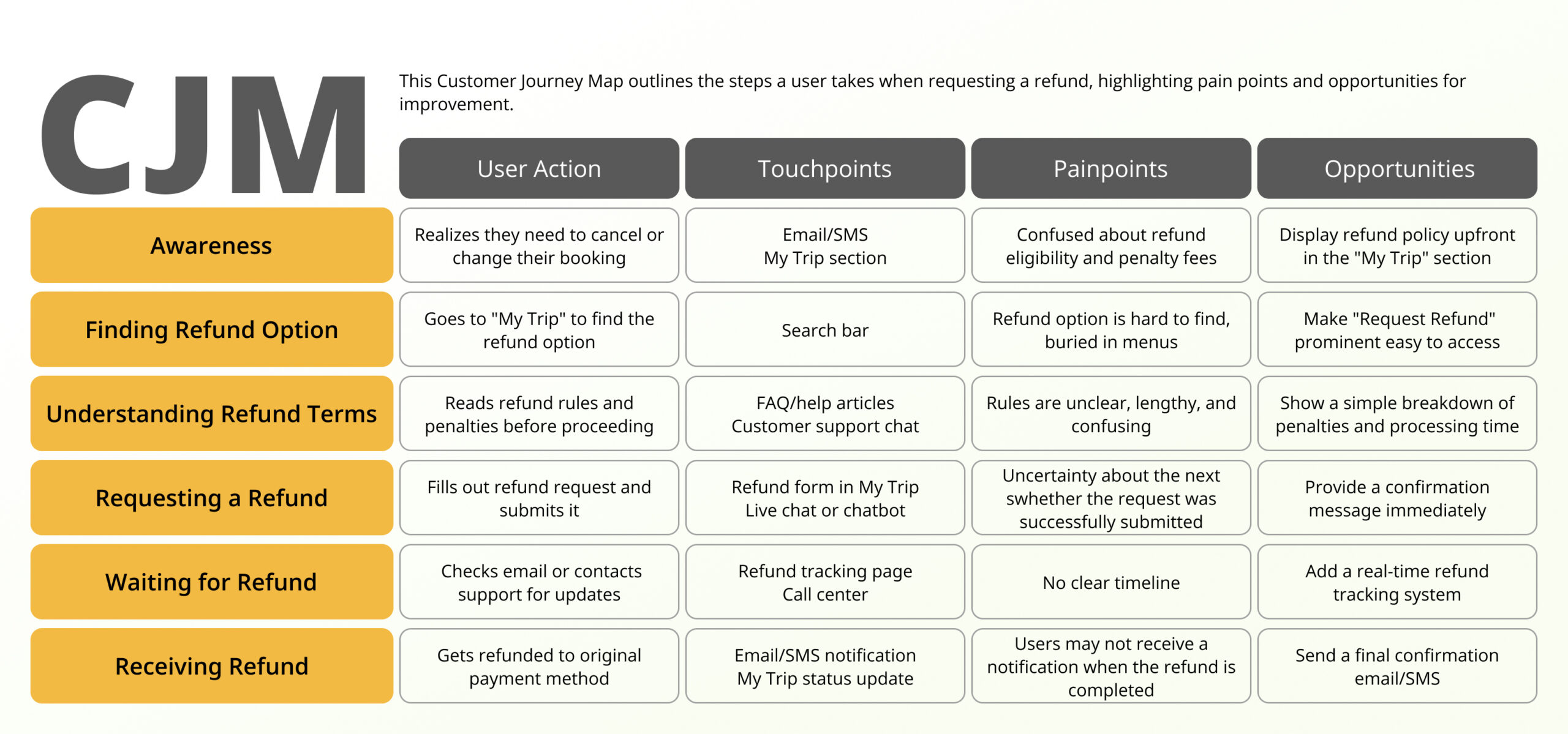
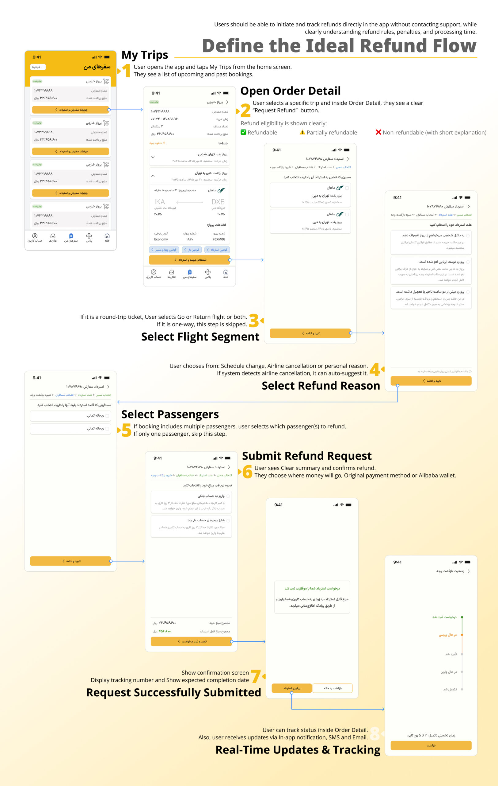
Customer Journey Map for the Refund Process
To understand why users struggle with refunds, we mapped the full refund journey in My Trip. This helped us clearly see where users get confused, feel uncertain, or contact support. The journey map highlights key pain points and shows where better visibility, clearer rules, and status tracking can improve the experience and reduce call center calls.
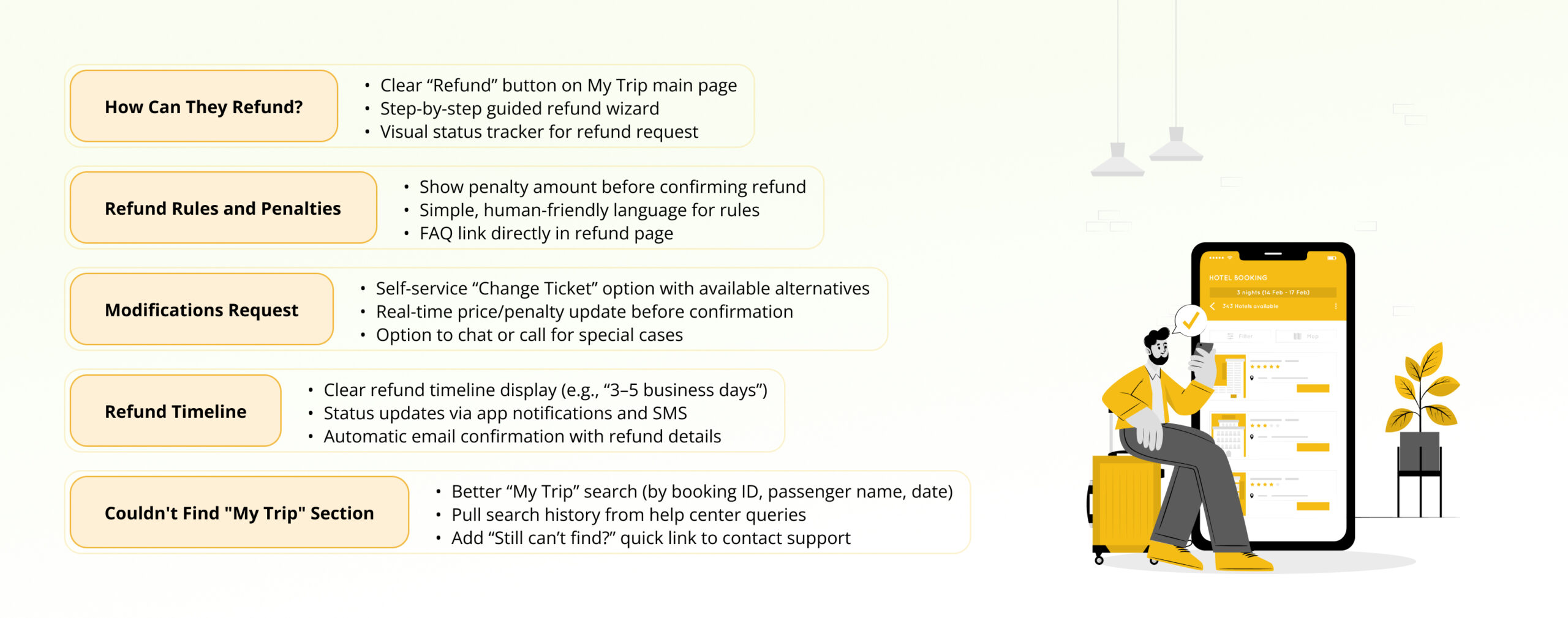
Ideate: Solution clustering
We generated potential solutions by brainstorming with the team and clustering them into categories, such as process simplification, clear communication, and better status visibility. This helped us connect user needs with feasible design improvements. Key ideas focused on streamlining refund steps, making rules transparent, adding clear timelines, and improving search and filtering within “My Trip.”
Since most of the issues identified in the call center recordings were related to the refund process, refining this flow can significantly improve the user experience and resolve many of the recurring problems. By simplifying and clarifying the steps involved in requesting a refund, you can reduce user frustration and the need for support calls, leading to better overall satisfaction.
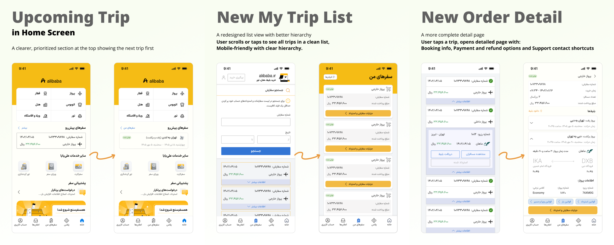
Prototype: Define the Ideal Refund Flow
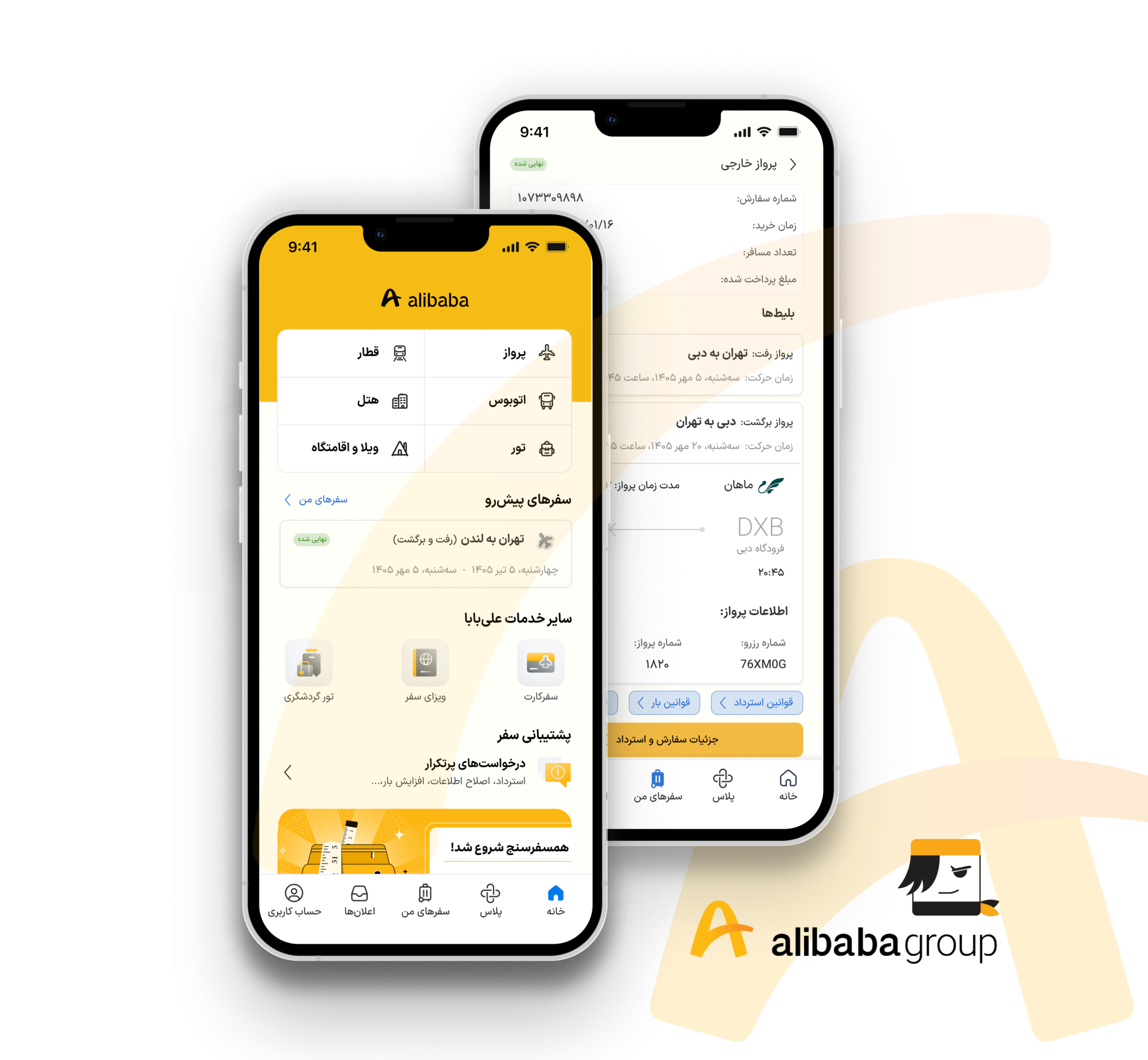
Using the Atlas design system, we created interactive mockups in Hydra to visualize the improved refund flow and “My Trip” experience. The prototype emphasized mobile-first design, clear refund progress indicators, simplified change requests, and easy trip retrieval. We ensured visual consistency while addressing the prioritized pain points.
Test: Usability Testing
After designing the first low-fidelity version of the refined “My Trip” experience, I conducted early validation through usability testing and behavioral tracking with 5 participants to validate clarity, transparency, and ease of use.
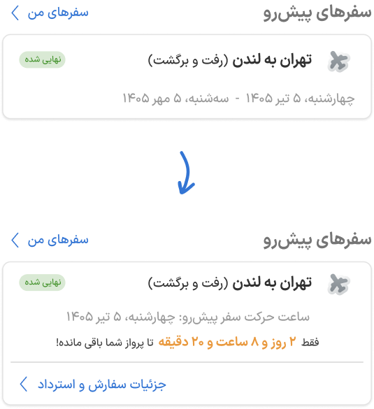
Problems
During testing, users showed hesitation when scanning the card.
They were unsure which timing was more relevant
Also, users didn’t realize they could access the Refund or Details section by tapping on the trip card.
Iteration
⚈ For round-trip flights: Only the next upcoming departure time is shown. This reduced visual clutter.
⚈ A bold countdown was added. This introduced urgency and clarity about what matters now.
⚈ Quick-access button was added on the card: View Order Details and Refund. This allowed immediate action without searching.
Result
⚈ Faster visual scanning and Clear focus on the next flight
⚈ Increased interaction with Order Detail
⚈ Higher click-through rate on refund entry point
Upcoming Trip Card Optimization
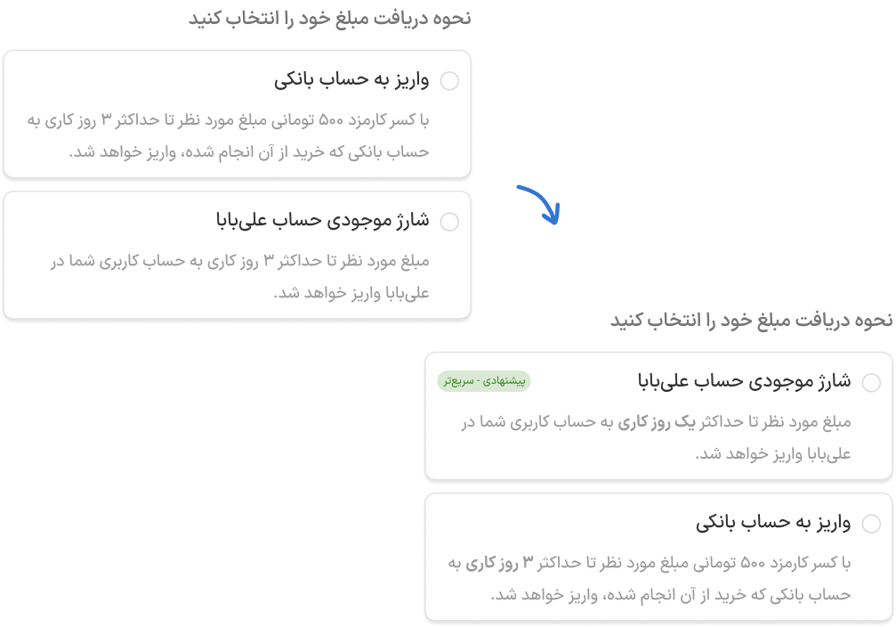
Problems
Users were unsure which refund method to choose.
Iteration
⚈ Hierarchy Improvement to guide faster decision-making.
⚈ Added “Recommended” badge on faster option
⚈ Timing was bolded in both cards to make the difference scannable.
Result
⚈ Faster decision-making and Reduced hesitation
⚈ Noticeable reduction in decision time during testing
Refund Method Decision Anxiety
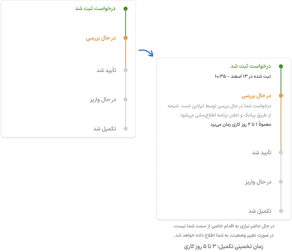
Problems
Users lacked clarity about meaning and duration in progress tracker. This uncertainty could increase anxiety and potentially lead to support calls.
Iteration
⚈ A short explanatory text was added under the active status step.
⚈ Each stage now includes an estimated timeframe.
Result
⚈ Reduced confusion around status meanings
⚈ Fewer questions about timeline
⚈ Lower likelihood of contacting support during processing stage
Tracking Page Clarity
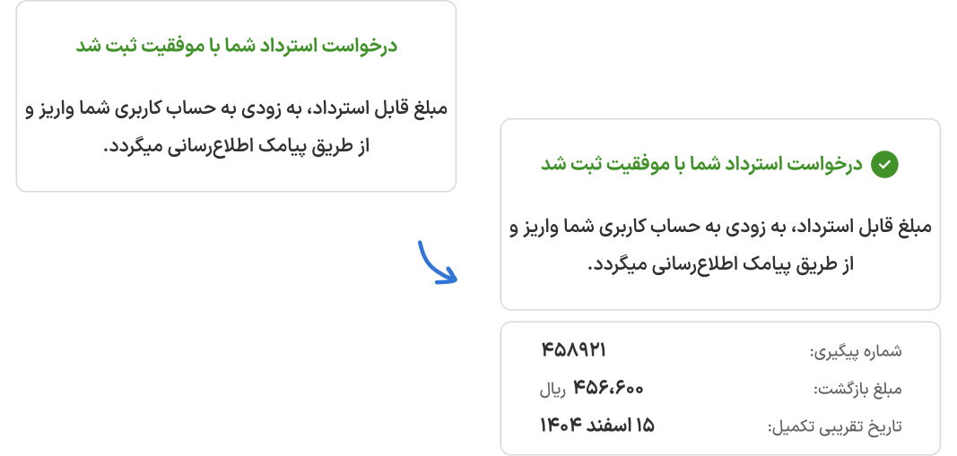
Problems
Users wanted stronger confirmation after submission.
Iteration
⚈ Bold green checkmark at the top of the page for visual confirmation.
⚈ Clear Confirmation Message added
⚈ Added Expected Completion Date added so users know when to expect the refund.
⚈ Each request now shows a unique tracking number.
Result
⚈ Users felt confident that their request was successfully submitted
⚈ Reduced follow-up questions and support calls
⚈ Clear timeline and tracking number increased transparency
Success Page Reassurance
Overall Achievement